Field types
Compare Flexim field types and their settings for text, numbers, dates, media, relations, components, and generated values.
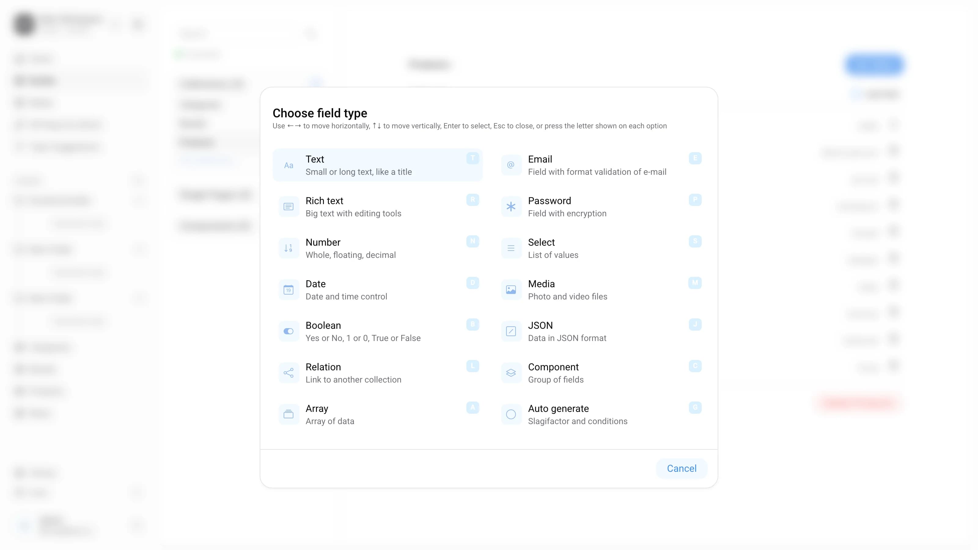
At present, CMS supports 14 types of fields. Each field is designed to contain a certain type of data filled in on the editing page. Below are all types of fields, where a definition is given for each, explaining how they work and what settings they have. The features of the components are also considered.
General settings
All fields have a displayed name and a name in the DB.
| Setting | Explanation |
|---|---|
| Field name | How field will be displayed in CMS |
| BD name | Unique field name for the DB and API (generated automatically from the name) |
All fields have additional field settings.
| Setting | Explanation |
|---|---|
| Required field | You will not be able to create a record if this field is not filled |
| Closed field | The value of this field is not given via the API |
AG-fields don’t have required field option, because they are generated automatically.
Fields
Text
The "Text" field displays a text field that can contain a small text. This field can be used for headings, descriptions, etc.
Special settings
| Setting | Explanation |
|---|---|
| Type | Choose between Short text and Big text. |
| For short text, there will be a one-line field, and for long text, several lines. |
Rich Text
The Rich Text field displays an editor with basic formatting options for working with text written in Markdown format. This field can be used for working with long text, for example for writing articles.
Number
The Number field displays a field for any type of number: integer, decimal, and floating.
Date
The Date field can display a date selection (year, month, day) and time (hour, minute).
Boolean
The Boolean field displays a toggle button for controlling boolean values (e.g., Yes or No, 1 or 0, True or False).
By default, the boolean value is "Null"
The Email field displays an email address field with format checking to ensure that the email address is valid.
Password
The Password field displays an encrypted password field.
Select
The Select field allows you to configure a list of values displayed in a drop-down list.
Special settings
| Setting | Explanation |
|---|---|
| Multiselect Checkbox | By checking the box, you allow multiple options to be selected instead of one. |
Example when a single Select is needed: Select the country of manufacture.
Example when Multiselect is needed: Select in which stores the product is located. | | Options | Add options for the select through a special input |
Relation
The Relation field allows you to set a connection with another Content Form, which should be a collection.
Special settings
| Setting | Explanation |
|---|---|
| Select collection | Select the collection to which we will refer |
| Type | Choose between Single connection or Multiple connections. |
Example Single: Product refers to a single item from the Category collection
Example Multiple: Category refers to multiple items from the Product collection |
Media
The Media field allows you to upload or select one or more media files (e.g., image, video) from those uploaded to the application's media library.
Special settings
| Setting | Explanation |
|---|---|
| Type | Choose between Single Media or Multiple Media. |
Example Single Media: Blog post cover
Example Multiple Media: Several product images on the product page. |
JSON
The JSON field allows you to store data in JSON format, such as JSON objects or arrays.
The JSON field is not shown on the content editing screen. It is intended for developers to attach structured data to a record via the API rather than to be edited by hand in the CMS.
Array
The Array field allows you to create data arrays.
Special settings
| Setting | Explanation |
|---|---|
| Separator | Method of separating data in the array via “,” or “ |
Auto Generate
Auto Generate field takes the filled information from the specified other fields and automatically applies the specified automation
Special settings
| Setting | Explanation |
|---|---|
| Automation type | Choose a way of automating data: Slagifactor, or comparison functions ( "=", ">", "<") |
| Slagifactor field (if slagifactor is selected) | Choose the field that should be transformed to create a slug |
| Field 1 and Field 2 (if comparison function is selected) | Choose fields for comparison using functions. |
Component
Components are a combination of several fields. By adding a Component field type, you will need to select an existing component. Components can be made single and repeating, which allows creating a repeatedly used set of fields.
Feature of the component
A component can be created in the Content-type constructor. The Component does not exist independently. But it can be embedded in Single page and Collection.
Special settings
| Setting | Explanation |
|---|---|
| Choose component | Select the required component from the list of previously created components |
| Type | Choose between Single component or Repeated component. |
Example Single component: Add a single "SEO" component (consisting of text fields Title, Description, Keywords) to the Products collection.
Example Repeated component: Add a repeating component "photos from Instagram" (consisting of photo, link to photo, profile of the author) on the product page. |
Read more on this topic